Showing posts with label Free DP Tutorials. Show all posts

Wednesday, July 23, 2008

Photoshop Techniques: A Simple Way to Enhance an Image


I wanted to share a few basic steps I took to enhance this image:


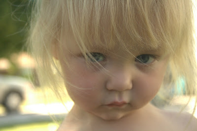
(By the way, my two year old daughter took this shot. I thought it was pretty cool).


I chose this image because the composition is cool and the angles are somewhat dramatic so it is a good start. Even Photoshop has a hard time making crappy photos look any good.


The first thing I did to this photo was duplicate it in Photoshop onto its own layer. This way I always have an original at the bottom of the stack. Then I went into the channels tab (usually right next to the layers tab) and looked at each channel individually by clicking on it and activating the eyeball next to it making sure all the other eyeballs were off. I decided I liked the look of the Green Channel so I went back to my layers (with the green channel still isolated) and went to image>apply image. I left the layer on merged and the channel to green. I applied it as a multiply. Then I turned on all my channels again. At this point my image had some funky colors to it...which I liked, but they were too much. I changed the top layer to an overlay and turned down the opacity to 47 percent. This overlayed the layer with the green channel merged into it over the original image. Doing this gave me the interesting color I wanted and all the contrast I would need. It looked like this:


Another way to get more contrast is to go to layer>new adjustment layer>curves and then form the curve into a gentle S shape. Make the dark pixels a little darker by pushing the left side of the curve down, and the bright pixels brighter by pushing the right side up. Since it is an adjustment layer you can go back and change it later, and also you can fine tune it by changing the opacity of it up and down. In the case of this picture I didn't need this step. Overlaying the color adjusted layer over the original gives plenty of contrast.


The last thing I did was merge all the layers and copy them to their own layer on top by pushing Ctrl+shft+alt+e (or hold down alt and go to layers>merge visible). With this layer selected I then go to Filters>distort>lens correction. Here I turn the vignetting all the way to black and push okay. Then change this layer to Darken and you have some hard core vignetting effects going on. This can be toned down by again just changing the opacity of the top layer.


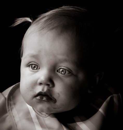
The end result is this:


much better!

Have fun trying it on your photos and posting them in the flickr group.

Try using different channels too. There endless possibilities.

Thursday, July 17, 2008

"Studio" Lighting at Home


I will be the first to admit that I don't know anything about professional lighting, but I have been able to get so cool effects just using lighting situations around my house. I want to describe the processing I did to this image to produce the image at the end of this post. I believe it is a great improvement. Here is the initial image:


It doesn't look like much, but the one thing I tried to do is get some really bright exposure behind the subjects face. I also made sure to take this in RAW format so I could expose it even more after the fact. You can do this when you open RAW images using photoshop. All I had to to get the exposure correct was make sure the subject was in shadow, and the scene behind her was in full sun. I exposed the camera for her face, which in turn blew out the background.


After I took the shot I took the RAW into photoshop and further exposed the picture. I gave it kind of a high key effect by making the whole image a little bit overexposed, even on the face. The only other photoshopping I did was a saturation layer with some masking, a crop, and some sharpening. I will describe the step by step.


The Hue/Saturation layer can be created by going to layers>new adjustment layer>hue saturation. Turn down the overall saturation to your liking. Now, the reason we use an adjustment layer is so we can mask out the adjustments we just made. This means we can make the hue/saturation apply to only parts of the image and not the whole thing. What I did is masked out the rosy cheeks, lips, and eyes. This means the whole image is desaturated, except for the parts I masked out. This makes them the focal point of the picture. You mask things out by painting black into the mask where you don't want the adjustments to apply.


I use the crop tool to crop it. I made sure to crop it to a standard proportion because I wanted to print it. Framing something that is not standard can be really expensive, but if your print is standard it can be done for dirt cheap.


Then I sharpened. There are several different ways to sharpen in the filters>sharpen menu. What I like to do however is use a high pass filter. Copy the entire image to a new layer by selecting the top layer then hitting CTRL>SHIFT>ALT>E. This merges the whole image and copies it to its own layer at the top of the stack, without changing all the layers below. Use the newly merged layer to do the high pass. Go to filters>other>high pass. Set it to about 90, then change that layers blending mode to soft light. Adjust the opacity of that layer up and down to minimize or maximize the effect. Too much can be bad, but doing it correctly really brings out detail.


Here is the final result. I was very pleased with this result. For me it is a perfect addition to the home gallery. I like the lighting effect because it almost looks like it was taken in a studio with a white background, but really it was just out on my front lawn.


Wednesday, July 16, 2008

HDR images: Basic Explanation and Tutorial

HDR stands for High Dynamic Range. An HDRI, therefore, is an image that has a high dynamic range of colors. In other words, it has a range of values that is much larger than 0-255 which is typical of a jpeg. For example, what appears as white on your screen would not necessarily be a value of 255, but could be 255 x 5 or 10. This may not make much sense, but allow me to explain its utility for photography and it should make sense to anyone who has even dabbled with a camera. Also, here is the wiki explanation http://en.wikipedia.org/wiki/High_dynamic_range_imaging


In photography, a common problem that inevitably confronts everyone, is exposing properly for both super bright and super dark areas at the same time. I especially notice it when taking landscaping shots. It is hard to get correct exposure for things in shadow, things in direct sun, and the sky all at the same time. The range of tones your camera can capture all at once is only so much. Usually what happens to me is my landscape is exposed correctly while my sky just becomes a solid white color with no detail. Like here:


Essentially, HDR solves this problem. It allows you to take one shot exposed for the sky, one for the landscape, and really however many you want, and then combine them. More exposures means larger range. If combined properly, you can bring out all the detail in the shadows, and in the highlights at the same time. For my HDR image of the photo above I used this exposure plus four others, 2 lower and 2 higher.


Keep in mind that you can get these different exposures in 2 different ways. One way is to use a tripod and actually take the picture several different times with different exposures. This way you have to make sure everything stays perfectly still. It is best to use auto exposure bracketing if you've got it, and take the pics in quick succession. The second way to do it is by simply taking one photo using RAW format, and change the exposure after the fact. Export each exposure you want to a jpeg for combining later. If you do it this way, I have found that you need to keep your ISO low because noisy images wont combine well. The HDR will only accentuate the noise. 400 or lower should do.


The program I use to combine my exposures into an HDR is photomatix. Combining exposures is really all this program does. Open all the images up and hit combine into HDR. Once you do this the program will spit out an image that looks funky. This is because it contains much more information then your monitor can even display at one time. If you hover over it you will see a little preview box that will show the different ranges of the image. It is hard to explain but you will see.


In order to get this image back to something you can actually display on screen you have to tone map it. This is also done in Photomatix. An easy way of thinking about it is taking a wide range of tones (wider then can be shown by the monitor) and converting it back to a range that can be shown in a regular jpeg. However, this jpeg is special because you get to choose how each different area of the image will be exposed.


The full settings and explanation of how I do this is contained in the previous post to this one.

Tone map to your hearts content. Mess with the settings till you get something you like.

My image from above came out as this once I got all the exposures combined into one:


As you can see it brings out way more detail in the overall image, and my sky and and lanscape are both exposed properly.

Please try it out, and share your best in our gallery. The best ones will be featured here for all to enjoy.

Monday, July 14, 2008

HDR landscape

Here is my latest attempt at HDR. The exposure problems were only minor (the detail in the sky was blown out) so the real reason I processed it like this was to bring out the details. I like how HDRs do that. I try to keep mine subtle too so they don't look cartoonish, flat, or overprocessed.

This is the Grand Canyon of Yellowstone. The HDR is made with only one photo. I took it in RAW so I could export different exposures after the fact. Actually, with this one I exported 5 different exposures. I used the original exposure plus -2, -1, +1 and +2. I use photomatix to combine them. After all images are combined I do the tone mapping. I will go over the basic settings I use here:

Keep the strength low unless you want to look way overprocessed. I think I used around 30-40.

I put smooting on High, and Microcontrast too (this is where the details really come out)

Adjust black and white clip as necessary.

The luminosity is important. Adjusting it can increase the local contrast as well. Adjust it to your preference. Overdoing this can again make things look overprocessed in my opinion.

Keep the saturation lower then you think. If it looks good in the preview it usually ends up being a little too much from what I have found.


When all that is done I usually take the exported, tone mapped imaged into photoshop and maybe adjust the curves, maybe sharpen it up. Of course it depends on the image.

This one came out alright. It does look pretty processed, but the HDR did bring back my sky, and there is a ton of detail in the cliffs.

Tuesday, August 28, 2007

Blurred Background...Sharp Subject


A Good Technique For Photographing Little Kids in Motion:

My daughter is one of my favorite subjects, but sometimes she can be hard to catch sitting still. In some ways that makes it even more fun. I like to try and capture the cuteness of my daughter's face and her energy and motion at the same time. If you just set a slower shutter speed the subject will be blurred beyond recognition. The object is too set a slower shutter speed , but to follow the object you want in focus with your camera as it moves. It works best if you start following the subject through the viewfinder, then open the shutter as you continue to follow as precisely as possible. Obviously, the most difficult part is following the subject perfectly. As you can see, in the picture above, I did alright but not perfect. It is a fun experiment, and it can make for really good results. I will post the settings of this shot below:


Shutter Speed - 1/30


Aperture - f/22


Iso - 400


I shot in Shutter priority mode. As you can see, 1/30 or below is usually sufficient.


Tuesday, March 20, 2007

Tutorial - Converting a Color Image Into Black and White.


To me there are many instances where black and white versions of an image look better then color. However, if you don't know what your doing in converting your images to black and white, they can end up being bland and uninteresting. Don't make the mistake of thinking that simply hitting desaturate is how it's done. On the contrary, converting to B&W can be a complicated task that can yield suprisingly varied results.


Here is my latest attempt at this kind of conversion:


Original


The converted one


To me this image is pleasing. It came out quite striking even without any color. To show what this image what have been like if it was just desaturated, I have uploaded a version here right underneath.


To understand how I got these kinds of results, first you should know that I took the picture in color. This is done for several reasons. Most of all, it is because if you take the picture in B&W you can never go to color, but you can go the opposite direction. Also, the color is what makes these variations in the B&W image possible. We bring them out using channels in Photoshop.

To show how the different channels of an image can vary greatly, let's look:


Red Channel


Green Channel


Blue Channel


To view each of these channels you must click on your channels tab and click on the channel you want. Make sure the eyeball next to the channel you want is the only one on.

By examining these different channels you can begin to see which one you want to show up the most. As you can tell from my final image, I liked the blue channel the most. It gave the skin tone a lot more contrast, and really made the eyes pop out as a focal point.

Once you know what you want, there are a few ways to proceed. All I did was go to layers>adjustment layer>channel mixer. I made sure monochrome was selected and I played with the channel sliders. This is making those channels we examined show through. I adjusted the sliders so that red was at 0, green was at 20, and blue was at 80. These numbers need to add up to 100 if you want to maintain the same exposure in your image.

If you want to get crazy with this, and feel that one channel looks better on part of the image, and another looks better on a different part, you can apply several of these layers adjusted in different ways and mask them out to make them affect only certain parts of the image. Or, you could copy and paste each individual channel to a layer and mask each one as necessary to get the effect you want. I masked my image so the red channel would affect the highlights of the hair because it really stands out against the black background. You can play with this endlessly.

Okay...after you have the right tones shining through in the right areas it's time to apply another adjustment layer. This time it is a curves layer. Apply a slight S-curve to darken the darks and lighten the lights. It should look like this.


Make sure and do this on an adjustment layer so you can play with the opacity slider of the layer. In this way you can really fine tune the curve application. This contrast is very important to a good B&W image.

One final part of the process that isn't really necessary, but that I like a lot, is to add a slight amount of color. This has to be done just right though. It has an awesome affect.

Flatten the black and white image and then make a copy of it on a new layer (Ctrl J). Make a new mask for this new layer by clicking on the new mask button in the layers pallette. Select the new layer and select all (ctrl a). Now copy (Ctrl c). Go to the layer mask by holding alt and clicking on it. Now paste the image to the mask (ctrl v). Now invert the mask (Ctrl I). This will be the mask for color we apply. It looks a lot better then just applying it without the mask. Try it. With our top layer all set up, it is time to add the color. Go to image>adjustments>hue/saturation. Set the hue of the layer to 25 and make sure that the colorize box is checked. Now play with the opacity of the layer so you get the desired effect. VOILA!

Click the image to see the full size.
Lunch

Hope this helps.

Tuesday, January 23, 2007

Polarized Filter Effect Using Photoshop


In an effort to bring you more suggestions on how to accomplish professional looking photography without all the fancy gear, I give you this tutorial. I found it a few days ago, and I think it would be of interest to many of you.


This tutorial explains how to accomplish a "polarized" filter effect, without actually owning one. The effect is achieved completely after the fact in Photoshop. Of course this photoshop technique is fairly easy, and totally nondestructive. The effect looks just like the real thing. You have to try it out. I did, and it really makes a difference.

Wednesday, January 3, 2007

Reverse Lens Macro Technique


Having just acquired my first SLR, I have been anxious to explore its possibilities. Of course, there is no better place to do this then on flickr. In the technique group there I read about using a reverse lens to get a macro effect. I have always wanted a macro lens, of course that didn't come with my camera. However, this technique enabled me to get super magnified close-ups without owning a macro lens at all. All I had to do was borrow one of my friends lenses and put it in front of mine in the reverse direction. This allows for amazing results. Read in the technique group for all the details on how to do it. Feel free to comment or write me regarding anything about how I achieved this image.