Here is my latest attempt at this kind of conversion:
Original

The converted one

To me this image is pleasing. It came out quite striking even without any color. To show what this image what have been like if it was just desaturated, I have uploaded a version here right underneath.
To understand how I got these kinds of results, first you should know that I took the picture in color. This is done for several reasons. Most of all, it is because if you take the picture in B&W you can never go to color, but you can go the opposite direction. Also, the color is what makes these variations in the B&W image possible. We bring them out using channels in Photoshop.
To show how the different channels of an image can vary greatly, let's look:
Red Channel
Green Channel
Blue Channel
To view each of these channels you must click on your channels tab and click on the channel you want. Make sure the eyeball next to the channel you want is the only one on.
By examining these different channels you can begin to see which one you want to show up the most. As you can tell from my final image, I liked the blue channel the most. It gave the skin tone a lot more contrast, and really made the eyes pop out as a focal point.
Once you know what you want, there are a few ways to proceed. All I did was go to layers>adjustment layer>channel mixer. I made sure monochrome was selected and I played with the channel sliders. This is making those channels we examined show through. I adjusted the sliders so that red was at 0, green was at 20, and blue was at 80. These numbers need to add up to 100 if you want to maintain the same exposure in your image.
If you want to get crazy with this, and feel that one channel looks better on part of the image, and another looks better on a different part, you can apply several of these layers adjusted in different ways and mask them out to make them affect only certain parts of the image. Or, you could copy and paste each individual channel to a layer and mask each one as necessary to get the effect you want. I masked my image so the red channel would affect the highlights of the hair because it really stands out against the black background. You can play with this endlessly.
Okay...after you have the right tones shining through in the right areas it's time to apply another adjustment layer. This time it is a curves layer. Apply a slight S-curve to darken the darks and lighten the lights. It should look like this. 
Make sure and do this on an adjustment layer so you can play with the opacity slider of the layer. In this way you can really fine tune the curve application. This contrast is very important to a good B&W image.
One final part of the process that isn't really necessary, but that I like a lot, is to add a slight amount of color. This has to be done just right though. It has an awesome affect.
Flatten the black and white image and then make a copy of it on a new layer (Ctrl J). Make a new mask for this new layer by clicking on the new mask button in the layers pallette. Select the new layer and select all (ctrl a). Now copy (Ctrl c). Go to the layer mask by holding alt and clicking on it. Now paste the image to the mask (ctrl v). Now invert the mask (Ctrl I). This will be the mask for color we apply. It looks a lot better then just applying it without the mask. Try it. With our top layer all set up, it is time to add the color. Go to image>adjustments>hue/saturation. Set the hue of the layer to 25 and make sure that the colorize box is checked. Now play with the opacity of the layer so you get the desired effect. VOILA!
Click the image to see the full size.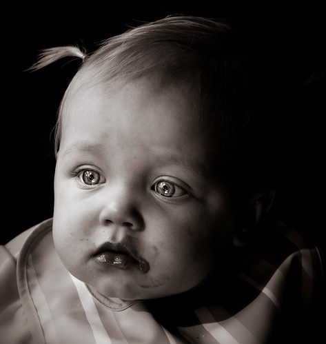
Hope this helps.


2 comments:
This is a great tutorial, thanks. I'm now feeling more comfortable with adjustment layers, vice committing the changes to copy layers.
Hi! Thank a lot for this tutorial. I have been trying to convert my images to B&W but have never been quite happy with any of them :-(
I always seem to get a lot of noise whenever i converted to B&W. This despite using the lowest ISO on my camera and shooting in RAW.
See what I mean here --> http://www.flickr.com/photos/aznin/2201213157/
I'm gonna try your technique :-) Wish me luck!
Post a Comment